A quick look at a US Air Force dataset, some geographical data visualization using d3.js and an enquiry into North Korean data collection method during the Korean War and their use (or non-use) in propaganda.
0. Index
1. The USAF THOR Dataset
2. Exploratory analysis: basic charts and graphs
3. Data visualization: Mapping the bombings using D3.js
4. North Korean data collection during the Korean War: The uses of data and the needs of propaganda
1. The USAF THOR Dataset
Last year, the United States’ Department of Defense launched an open data platform on www.data.mil. The site was launched with a very modest budget ($10, 000), is still a beta product as of October 2017 and so far only hosts a few datasets. One particular dataset, however, the Theater History of Operations (THOR) dataset, is a trove of information on American military operations overseas as it lists all aerial bombings from World War I through Vietnam. If some people have started looking into the data on the Vietnam War and WW II and produced nice visualization, the Korean War, true to its reputation as a “forgotten war”, has not gathered much interest.
The Air Force played a crucial role in the war and in its aftermath. The ceaseless bombings, which may have killed up to 20% of the country’s population and destroyed over half a million homes, are an important part of the collective memory of the war in the North. As Charles Armstrong puts it:
[F]or the North Koreans, living in fear of B-29 attacks for nearly three years, including the possibility of atomic bombs, the American air war left a deep and lasting impression. The DPRK government never forgot the lesson of North Korea’s vulnerability to American air attack, and for half a century after the Armistic continued to build up antiaircraft defenses, underground installations, and eventually nuclear weapons, to ensure that North Korea would not find itself in such a position again. The long-term psychological effect of the war on the whole of North Korea society cannot be overestimated. The war against the United States, more than any other single factor, gave North Koreans a collective sense of anxiety and fear of outside threats that would continue long after the war’s end.
While certainly not the only source of the country’s anti-Americanism, the bombings, like allegations of biological warfare use, are invariably mentioned in North Korean books, documentaries and museums about the Korean War as yet another demonstration of American cruelty towards the Korean people:

The data from the THOR dataset has been manually compiled from punch cards and records from the United States National Archives. The original records were produced by the Air Force’s statistical service at the urging of historians. There are two datasets for the Korean War. The first one contains information for various bombing missions between 1950 and 1953, but lacks information about the missions’ target locations. The second one, the “Exeter” collection, is much more detailed and contains geographical information but is limited to missions flown by B-29 aircrafts between June 1951 and December 1952. Both datasets are partial, the first one accounting for 12 879 missions and 106 392 tons of bombs, the second one for 9 876 missions and 76 775 tons of bombs. The total volume of bombs dropped on North Korea over the course of the war is generally estimated to be over 600 000 tons, so the datasets only account for 17 and 13% of the total bombings respectively.
Because of its more detailed content, we’ll be taking a more in-depth look at what the “Exeter” dataset has in store, which should give us the opportunity to put some charts and numbers on a crucial aspect of the Korean war which still shapes U.S. – DPRK relations today.
2. Exploratory analysis
We’ll first start by using R to perform basic data manipulation and pull out some simple statistics. Let’s first take a quick look at the columns:
data <- read.csv('THOR_Korean_Bombing_Operations_Exeter.csv')
colnames(data)
[1] “ROW_NUMBER” “MISSION_NUMBER” “OP_ORDER” “UNIT” “MISSION_DATE”
[6] “AIRCRAFT_TYPE_MDS” “NBR_ATTACK_EFFEC_AIRCRAFT” “SORTIE_DUPE” “NBR_ABORT_AIRCRAFT” “NBR_LOST_AIRCRAFT”
[11] “TARGET_NAME” “TGT_TYPE” “SOURCE_UTM_JAPAN_B” “SOURCE_TGT_UTM” “TGT_MGRS”
[16] “TGT_LATITUDE_WGS84” “TGT_LONGITUDE_WGS84” “SOURCE_TGT_LAT” “SOURCE_TGT_LONG” “NBR_OF_WEAPONS”
[21] “WEAPONS_TYPE” “BOMB_SIGHTING_METHOD” “TOTAL_BOMBLOAD_IN_LBS” “TOT” “MISSION_TYPE”
[26] “ALTITUDE_FT” “CALLSIGN” “BDA” “NOSE_FUZE” “TAIL_FUZE”
[31] “CALCULATED_BOMBLOAD_LBS” “RECORD_SOURCE”
Some column headers are self-explanatory, others not so much. Fortunately, the dataset comes with a dictionary explaining most of the column labels and the str() or summary() command give us enough additional information to make sense out of the whole thing. For starters, let’s look at the summary of the “CALCULATED_BOMBLOAD_LBS” column:
> summary(data$CALCULATED_BOMBLOAD_LBS)
Min. 1st Qu. Median Mean 3rd Qu. Max. NA’s
100 1500 5000 15550 15500 403500 1176
The median amount is relatively low compared to the maximum suggesting a majority of smaller payloads and a few much larger ones. We can try to see if there is a particular timeframe within which those bombs were dropped in order to link them to a particular campaign. To do so, we’ll need to subset our dataframe and convert the MISSION_DATE column to a usable Date format that R can understand. This will be a bit tricky as R’s date parser will interpret dates such 1/27/52 as January 27th, 2052. To bypass this, we’ll use the following commands:
subset <-  (data[c("MISSION_DATE", "TARGET_NAME", "CALCULATED_BOMBLOAD_LBS")])
subset <- subset[complete.cases(subset), ]
subset$MISSION_DATE = as.Date(as.character(format(as.Date(as.character(subset$MISSION_DATE), '%m/%d/%y'), '%m/%d/19%y')), '%m/%d/%Y')
Now we’ll look at where and when the 1% top payloads were dropped:
top_bombs <- (subset[which(subset$CALCULATED_BOMBLOAD_LBS > quantile(subset$CALCULATED_BOMBLOAD_LBS, probs = c(0.99))), ])
top_bombs <- top_bombs[order(-top_bombs$CALCULATED_BOMBLOAD_LBS), ]
top_bombs
      MISSION_DATE    TARGET_NAME CALCULATED_BOMBLOAD_LBS
7737    1952-07-21         Chosin                  403500
7847    1952-07-30                                 394000
8017    1952-08-11        Hokusen                  373000
8035    1952-08-13           Anak                  372000
7922    1952-08-05       Hoechong                  341000
7708    1952-07-19         Chosin                  337500
6490    1952-03-25      Pyongyang                  336000
6511    1952-03-28        Sinanju                  331500
8725    1952-09-30      Namsan-ni                  331000
7606    1952-07-11      Pyongyang                  322800
6510    1952-03-28        Sinanju                  310500
7489    1952-07-02        Huichon                  310000
7488    1952-07-02   Sanwang-dong                  307500
1392    1951-08-14      Pyongyang                  307000
6489    1952-03-25      Pyongyang                  303000
7846    1952-07-30                                 296000
9647    1952-11-28        Sinuiju                  288000
7941    1952-08-06       Singosan                  282500
8283    1952-09-03         Chosin                  282000
7630    1952-07-11      Pyongyang                  278500
6533    1952-04-01        Kwaksan                  272500
10054   1952-12-26       Chong-ju                  271000
8282    1952-09-03         Chosin                  267500
6509    1952-03-28        Sinanju                  267000
6488    1952-03-25      Pyongyang                  256000
7772    1952-07-23        Yangdok                  255000
6526    1952-03-31                                 253000
1515    1951-08-25         Rashin                  246000
8719    1952-09-30      Namsan-ni                  244000
8840    1952-10-07     Taeyu-Dong                  234000
9571    1952-11-24       Hoechang                  234000
8195    1952-08-27           Sopo                  231500
8718    1952-09-30      Namsan-ni                  231000
7786    1952-07-24        Hamhung                  222000
7683    1952-07-15   Chonggo-dong                  221500
6151    1952-02-22        Wa-dong                  221000
210     1951-06-11        Hamhung                  220000
923     1951-07-19      Chinnampo                  215000
5712    1952-01-25       Songchon                  214000
6955    1952-05-25        Kwaksan                  213500
7797    1952-07-25          Kowon                  212500
8071    1952-08-18         Nakwon                  212500
9557    1952-11-23    Yongmi-dong                  210000
10102   1952-12-29      Taegam-ni                  210000
1083    1951-07-27        Kyomipo                  209500
1121    1951-07-30        Kyomipo                  209000
1122    1951-07-30        Kyomipo                  209000
5503    1952-01-16        Chongju                  208500
6896    1952-05-20        Kwaksan                  208500
5456    1952-01-14        Sinanju                  207500
5694    1952-01-24        Sunchon                  207500
6653    1952-04-28        Sonchon                  207500
8799    1952-10-04    Pongchongol                  207300
8236    1952-08-30      Pyongyang                  206300
5475    1952-01-15       Songchon                  205000
6668    1952-04-30        Chongju                  205000
7605    1952-07-11      Pyongyang                  204500
7002    1952-05-29        Huichon                  204000
6660    1952-04-29   Sinhung-dong                  203500
7011    1952-05-30        Sonchon                  203500
9955    1952-12-19      Unhung-ni                  203000
8094    1952-08-20      Pyongyang                  202600
6804    1952-05-12        Kwaksan                  202000
6606    1952-04-23        Huichon                  201500
7040    1952-06-02        Kwaksan                  201500
10118   1952-12-30    Wollywon-ni                  198000
5851    1952-02-01       Songchon                  197000
5949    1952-02-07        Sinanju                  197000
6548    1952-04-16        Sinanju                  197000
6566    1952-04-19        Chongju                  197000
6757    1952-05-08        Kwaksan                  196000
7821    1952-07-28        Hamhung                  196000
6397    1952-03-11                                 195500
6595    1952-04-22        Sinanju                  195000
6829    1952-05-14   Sinhung-dong                  195000
6842    1952-05-15   Sinhung-dong                  195000
6978    1952-05-27 Kogunyong-dong                  195000
7091    1952-06-06        Sonchon                  195000
7401    1952-06-25        Huichon                  195000
8673    1952-09-26     Pachunjang                  195000
8849    1952-10-08          Kowon                  195000
9058    1952-10-20     Taeju-dong                  195000
9842    1952-12-11       Pingjang                  195000
11047   1952-06-27   Sinhung-dong                  195000
6374    1952-03-07        Wa-dong                  194500
6636    1952-04-26        Chongju                  194500
9738    1952-12-04        Cholsan                  194500
9930    1952-12-17   Yongsan-dong                  194500
6389    1952-03-10   Sinhung-dong                  194000
6989    1952-05-28        Huichon                  194000
7018    1952-05-31       Songchon                  194000
6438    1952-03-16                                 193500
6414    1952-03-13                                 192500
8823    1952-10-06           Sopo                  191300
9085    1952-10-22          Okung                  191000
7695    1952-07-16        Yangdok                  190000
6248    1952-02-28        Wa-dong                  189000
7030    1952-06-01        Huichon                  189000
6166    1952-02-23   Sinhung-dong                  188500
The Chosin reservoir was the target of the biggest payload dropped as well as numerous other missions, all of them posterior to the 1950’s battle the reservoir is most commonly associated with. Pyongyang is another of the most recurring target for heavy bombings, and while the missions over Chosin were concentrated in the Summer of 1952, the bombings of Pyongyang are spread evenly throughout the war. Let’s try to plot the monthly frequency of bombings of Pyongyang:
pyongyang <- subset[subset$TARGET_NAME == "Pyongyang", ]
pyongyang$TARGET_NAME <- NULL
pyongyang$MISSION_DATE <- as.Date(cut(pyongyang$MISSION_DATE, breaks = "month"))
ggplot(pyongyang, aes(MISSION_DATE)) + geom_bar() + labs(x = "Month", y = "Number of bombings"))

and the volumes:
ggplot(pyongyang, aes(MISSION_DATE, CALCULATED_BOMBLOAD_LBS / 2000)) + labs(x = "Month", y = "Volume of bombs dropped in tons") + stat_summary(fun.y = sum, geom = "bar")
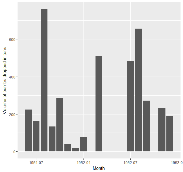
B-29 bombarded Pyongyang almost monthly, with an average of roughly 10 bombings per month for the whole period and dropped over 4000 tons of bombs, equivalent to about one third of Little Boy‘s yield. Bearing in mind that the data is merely a subset of the total amounts of bombs dropped, this would give credence to the North Korean claim that only two modern buildings remained standing in Pyongyang in 1953.
Let’s now see how the different yields were used throughout the war. We’ll cut the bomb loads into quartiles, with Q1 being the lightest and Q4 the heaviest and plot the count of each quartile for every month:
library(dplyr)
library(scales)

subset$MISSION_DATE <- as.Date(cut(subset$MISSION_DATE, breaks = "month"))
subset$QUART <- cut(subset$CALCULATED_BOMBLOAD_LBS, quantile(subset$CALCULATED_BOMBLOAD_LBS), include.lowest = TRUE)
levels(subset$QUART) <- c("0 - 0.75 tons", "0.75 - 2.5 tons", "2.5 - 7.75 tons", "7.75 - 202 tons")
counts <- count(subset, c("MISSION_DATE", "QUART"))
ggplot(counts, aes(MISSION_DATE, freq)) + geom_col() + facet_grid(~QUART) + stat_smooth(method = "lm", col = 2) + scale_y_continuous(limit=c(10,NA),oob=squish) + theme(axis.text.x = element_text(angle = 45, hjust = 1)) + labs(x = "Month", y = "Number of missions")
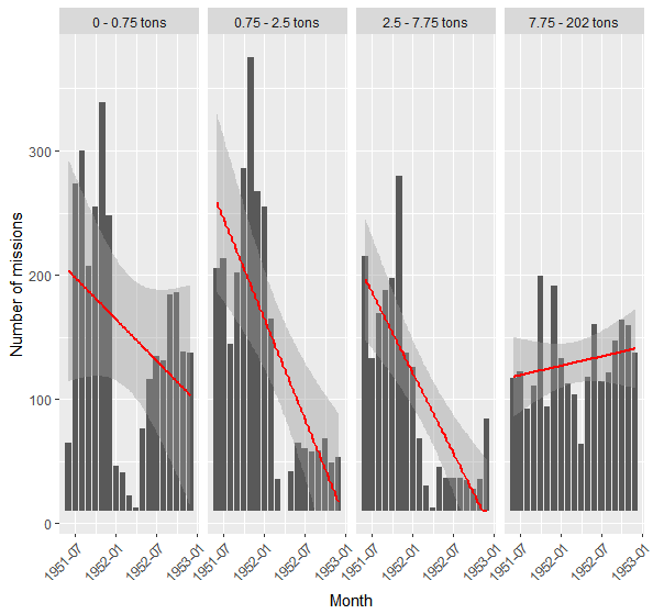
Over the course of the war, the United States Air Force drastically reduced the number of its bombing missions, especially those delivering medium-sized bombs. While missions with lighter payloads diminished, the number of heavy bombings underwent a slight increase over the course of the war. Indeed, most strategic targets that could be destroyed with smaller precise strikes had been destroyed by 1952 and the end of the war was marked by indiscriminate carpet bombing.
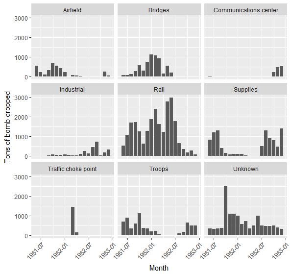
Let’s try to further visualize this shift by looking at evolution of the types of target during the course of the war. The dataset has a TGT_TYPE column with a list of over 400 different target types. That is too much for us to cleanly process, so we’ll subset the dataset to only consider types of target that appear at least 10 times in the dataset:
targets <- data[c("MISSION_DATE", "CALCULATED_BOMBLOAD_LBS", "TGT_TYPE")]
targets <- targets[complete.cases(targets), ]
targets <- subset(targets, table(targets$TGT_TYPE)[targets$TGT_TYPE] >= 10)
targets$TGT_TYPE <- factor(targets$TGT_TYPE)
Now the factor TGT_TYPE only has 57 levels, which is much more manageable:
 [1] "\"Troops, supplies, and vehicles\"" "Airfield"                           "Ammunition dump"                    "Artillery and troops"
 [5] "Artillery position"                 "Artillery positions"                "Barracks area"                      "Bridge"
 [9] "Chemical plant"                     "Close support target"               "Command post"                       "Communications center"
[13] "East railroad by-pass bridge"       "Front line target"                  "Highway bridge"                     "Hwanghae Steel mill"
[17] "Hydro-electric plant"               "Industrial area"                    "Jettisoned"                         "Last resort target"
[21] "Marshalling yard"                   "Nitrogen fertilizer plant"          "North railroad by-pass bridge"      "Number three airfield"
[25] "Ore processing plant"               "Personnel and supply shelters"      "Personnel shelters"                 "Railroad bridge"
[29] "Railroad bridge complex"            "Railroad by-pass bridge"            "Railroad track"                     "Returned"
[33] "Salvoed"                            "Secondary target"                   "South railroad by-pass bridge"      "Southeast airfield"
[37] "Staff school"                       "Steel mill"                         "Supplies"                           "Supplies and personnel"
[41] "Supply and personnel shelter"       "Supply and personnel shelters"      "Supply area"                        "Supply area number two"
[45] "Supply center"                      "Supply shelters"                    "Target of opportunity"              "Traffic choke point"
[49] "Troop assembly areas"               "Troop concentration"                "Troop concentrations"               "Troop Concentrations"
[53] "Troops"                             "Troops and artillery position"      "Troops and guns"                    "Troops and supplies"
[57] "Unknown"                            "Unknown target"                     "West railroad by-pass bridge"
But we should be able to shave off a few more by grouping them into more general categories such as Troops, Supplies, Railroad… Some of the categories will overlap due to labels such as “Supply and personnel shelter” which would apply to both Supplies and Troops, so we will first create new columns of booleans for each type, then we’ll gather all the booleans in a single column with dplyr and plot the results. In the process we’ll remove a few less interesting target types, such as “Returned”, “Jettisoned” or “Salvoed”. There is probably a much more elegant way to go about this, but the following R code does the job:
targets <- data[c("MISSION_DATE", "CALCULATED_BOMBLOAD_LBS", "TGT_TYPE")]
targets$MISSION_DATE = as.Date(as.character(format(as.Date(as.character(targets$MISSION_DATE), '%m/%d/%y'), '%m/%d/19%y')), '%m/%d/%Y')
targets$MISSION_DATE <- as.Date(cut(targets$MISSION_DATE, breaks = "month"))
targets <- targets[complete.cases(targets), ]
targets <- subset(targets, table(targets$TGT_TYPE)[targets$TGT_TYPE] >= 10)

# Tags all the empty targets as "Unknown"
targets$TGT_TYPE <- sub("^$", "Unknown", targets$TGT_TYPE)
# Combines all the targets containing "airfield" as they do not overlap with any other groups and are easily merged
targets$TGT_TYPE[grep('airfield',targets$TGT_TYPE)]<-"Airfield"
targets$TGT_TYPE <- factor(targets$TGT_TYPE)

Rail <- c("Marshalling yard", "Railroad bridge complex", "South railroad by-pass bridge", "North railroad by-pass bridge", "Railroad bridge", "Railroad by-pass bridge", "Railroad track", "West railroad by-pass bridge")
Bridges <- c("Railroad bridge complex", "Bridge", "South railroad by-pass bridge", "Highway bridge", "East railroad by-pass bridge", "Railroad by-pass bridge", "West railroad by-pass bridge")
Troops <- c("Troops", "Supplies and personnel", '"Troops, supplies, and vehicles"', "Staff school","Troops and artillery position","Troop assembly areas", "Artillery and troops", "Command post", "Personnel shelters", "Artillery position", "Artillery positions", "Troops and guns", "Front line target", "Barracks area", "Personnel and supply shelters", "Supply and personnel shelter", "Supply and personnel shelters", "Troop concentration", "Troop concentrations", "Troop Concentrations")
Supplies <- c("Supplies and personnel", "Ammunition dump",'"Troops, supplies, and vehicles"', "Supply area number two", "Troops and guns", "Personnel and supply shelters", "Supply and personnel shelter", "Supply center", "Supply area", "Supply and personnel shelters", "Troops and supplies", "Supply shelters")
Industrial <- c("Hydro-electric plant", "Industrial area", "Nitrogen fertilizer plant", "Ore processing plant", "Steel mill", "Hwanghae Steel mill", "Chemical plant")
Unknown <- c("Unknown", "Unknown target")

groups <- setNames(list(Rail, Bridges, Troops, Supplies, Industrial, Unknown), c("Rail", "Bridges", "Troops", "Supplies", "Industrial", "Unknown")) for (level in levels(targets$TGT_TYPE)) { print(level) if (!(level %in% c(Rail, Bridges, Troops, Supplies, Industrial, Unknown))) { if (!(level %in% colnames(targets))) { targets[level] = FALSE } targets[level][targets$TGT_TYPE == level, ] = TRUE } else { for (i in 1:length(groups)) { if (level %in% groups[[i]]){ if (!(names(groups[i]) %in% colnames(targets))) { targets[names(groups[i])] = FALSE } targets[names(groups[i])][targets$TGT_TYPE == level, ] = TRUE } } } } # The TGT_TYPE column is useless now that we have the booleans columns so we drop it, along with a few others targets$TGT_TYPE = NULL targets[c("Returned", "Salvoed", "Jettisoned", "Close support target", "Last resort target", "Secondary target", "Target of opportunity")] = NULL # Merges the boolean columns targets %>%
    gather(subset.bool, logic, -MISSION_DATE, -CALCULATED_BOMBLOAD_LBS) %>%
    filter(logic) %>%

# And plots the result using ggplot and facets
ggplot(aes(MISSION_DATE, CALCULATED_BOMBLOAD_LBS / 2000)) +
    geom_col() +
    facet_wrap(~subset.bool) +
    theme(axis.text.x = element_text(angle = 45, hjust = 1)) +
    labs(x = "Month", y = "Tons of bomb dropped")
And while we’re at it, let’s also plot the number of missions for each target type:
targets %>%
    gather(subset.bool, logic, -MISSION_DATE, -CALCULATED_BOMBLOAD_LBS) %>%
    filter(logic) %>%

    # And plots the result using ggplot and facets
    ggplot(aes(MISSION_DATE)) +
    geom_bar() +
    facet_wrap(~subset.bool) +
    theme(axis.text.x = element_text(angle = 45, hjust = 1)) +
    labs(x = "Month", y = "Number of missions")
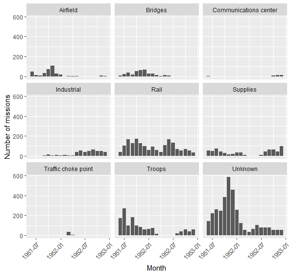
We can see that until mid-1952, strategic targets such as airfields, bridges and railways had been bombed extensively. The number of bombings and their volume decreases afterwards as those targets were all destroyed. Consequently, industrial sites become substitution targets, and the number of bombings over such targets sharply rises in 1952.
3. Mapping the bombings
The Javascript data visualization library D3.js has several very useful features to work with maps, which we could use to get a better view of the breadth of the US air raids. The first step will be to get the basic geographical data to draw a simple map of North Korea upon which to project our bombing data. Fortunately, the GADM database of Global Administrative Areas offers geographical datasets for most of the world’s countries and regions. The data is free to use for academic and non-commercial purposes and comes in several different formats. Now D3 only supports GeoJSON and TopoJSON, none of which are directly available from GADM, but converting from a common format such as shapefile is a very straightforward process. I’ve opted for TopoJSON as it is lighter than GeoJSON. The file, which contains data about the borders of contemporary North Korea and its contemporary administrative regions, is available along with the rest of the project on Github. Note that you will need a web server to run the code locally as Javascript can’t access the local filesystem from a browser.
After loading the JSON data, we center the map on 40.3N, 127.5E (a few miles North of Hamhung) and scale it before displaying it :
var width = 680,
    height = 780;

var svg = d3.select(".wpd3-155-0").append("svg")
    .attr("width", width)
    .attr("height", height);

d3.json("PRK_adm1.topojson", function(error, nk) {
  if (error) return console.error(error);
  console.log(nk);

  var projection = d3.geo.mercator()
        .center([127.5, 40.3])
        .scale(5800)
        .translate([width/2, height/2]);

  var path = d3.geo.path()
               .projection(projection);

  var provinces = topojson.feature(nk, nk.objects.PRK_adm1);

  svg.append("path")
      .datum(provinces)
      .attr("d", path);
});
Next, we need to add a little bit of CSS styling to make the provinces and their borders visible. We’ll also add the location of some of North Korea’s major cities with coordinates taken from Wikipedia :
.province { fill : #ccc; stroke : #ffe; stroke-width: 2px;   stroke-dasharray: 2,2; stroke-linejoin: round;}
.region-labels { fill: #aaa; font-size : 14px; font-weight : bold; }
.city-labels { font-size : 12px; }
var major_cities = [{"city" : "Pyongyang", "coordinates" : [125.75, 39.033]},
                    {"city" : "Hamhung", "coordinates" : [127.535556, 39.91250]},
                    {"city" : "Namp'o", "coordinates" : [125.399998, 38.733304]},
                    {"city" : "Wonsan ", "coordinates" : [127.446111, 39.1475]},
                    {"city" : "Sinuiju", "coordinates" : [124.4, 40.1]},
                    {"city" : "Tanch'on", "coordinates" : [128.911, 40.458]},
                    {"city" : "Kaech'on", "coordinates" : [125.903663052, 39.69249723]},
                    {"city" : "Kaesong", "coordinates" : [126.55444, 37.97083]},
                    {"city" : "Sariwon", "coordinates" : [125.75444, 38.50778]}];

var width = 680,
    height = 780;

var svg = d3.select(".wpd3-155-1").append("svg")
    .attr("width", width)
    .attr("height", height);


d3.json("PRK_adm1.topojson", function(error, nk) {
  if (error) return console.error(error);
  console.log(nk);

  var projection = d3.geo.mercator()
        .center([127.5, 40.3])
        .scale(5800)
        .translate([width/2, height/2]);

  var path = d3.geo.path()
               .projection(projection);

  var provinces = topojson.feature(nk, nk.objects.PRK_adm1);

  svg.append("path")
      .datum(provinces)
      .attr("d", path);

  svg.selectAll(".province")
    .data(topojson.feature(nk, nk.objects.PRK_adm1).features)
    .enter().append("path")
    .attr("class", function(d) { return "province " + d.properties.HASC_1; })
    .attr("d", path)

  svg.selectAll(".region-labels")
    .data(topojson.feature(nk, nk.objects.PRK_adm1).features)
    .enter()
    .append("text")
    .attr("class", "region-labels")
    .attr("dx", "-2em")
    .attr("transform", function(d) { return "translate(" + path.centroid(d) + ")"; })
    .text(function(d) { return d.properties.NAME_1; });

  svg.selectAll("cities")
    .data(major_cities)
    .enter()
    .append("circle")
    .attr("cy", function (d) { return projection(d.coordinates)[1]; })
    .attr("cx", function (d) { return projection(d.coordinates)[0]; })
    .attr("r", 3)
    .style("fill", "black");

  svg.selectAll(".city-labels")
    .data(major_cities)
    .enter()
    .append("text")
    .attr("transform", function(d) { return "translate(" + projection(d.coordinates) + ")"; })
    .attr("class", "city-labels")
    .attr("dy", "-1em")
    .text(function (d) { return d.city; })
    .style("text-anchor", "middle");

});
Now that the basemap is ready, we only have to add the data relative to the air raids on top of it. There will be some pre-processing to do before we can send the data over to D3, so let’s go back to R. As a reminder here is what the summary of the dataset looks like:
> str(data)
'data.frame': 11052 obs. of 32 variables:
$ ROW_NUMBER : int 2 3 4 5 6 7 8 9 10 11 ...
$ MISSION_NUMBER : Factor w/ 671 levels "","1000","1001",..: 19 19 19 19 19 19 19 19 19 19 ...
$ OP_ORDER : Factor w/ 586 levels "","106-52","107-52",..: 74 74 74 74 74 74 74 74 74 74 ...
$ UNIT : Factor w/ 5 levels "","19th Bomb Group",..: 5 3 3 5 5 3 5 5 3 5 ...
$ MISSION_DATE : Factor w/ 567 levels "1/1/52","1/10/52",..: 324 324 324 324 324 324 324 324 324 324 ...
$ AIRCRAFT_TYPE_MDS : Factor w/ 9 levels "","B-29","B-45",..: 2 2 2 2 2 2 2 2 2 2 ...
$ NBR_ATTACK_EFFEC_AIRCRAFT: int 1 NA 1 1 1 1 3 7 13 4 ...
$ SORTIE_DUPE : int NA 1 1 NA NA 1 NA NA NA NA ...
$ NBR_ABORT_AIRCRAFT : int NA NA NA NA NA NA NA NA 1 NA ...
$ NBR_LOST_AIRCRAFT : Factor w/ 7 levels "","\"Accomplished visual, photo, and radar reconnaissance of route Yoke three of the special mission. Aircraft employed O-15 type "| __truncated__,..: 1 1 1 1 1 1 1 3 1 1 ...
$ TARGET_NAME : Factor w/ 1169 levels "","\"2 aircraft accomplished special missions for FEAF Bomber Command, while the third ship accomlished photgraphic coverage of BC"| __truncated__,..: 516 1 1 501 596 953 1050 1031 1 1 ...
$ TGT_TYPE : Factor w/ 422 levels "","\"\"\"A\"\"\"",..: 204 196 413 332 259 205 204 259 260 384 ...
$ SOURCE_UTM_JAPAN_B : Factor w/ 9 levels "","CT 1940","CT 1949",..: 1 1 1 1 1 1 1 1 1 1 ...
$ SOURCE_TGT_UTM : Factor w/ 2714 levels "","\"BT 8314, BT 9356, and CT 0036\"",..: 1419 1 2542 2582 1763 204 2714 153 2549 1455 ...
$ TGT_MGRS : Factor w/ 2198 levels "","51SUC5070",..: 1464 1 199 240 1752 448 401 604 207 1493 ...
$ TGT_LATITUDE_WGS84 : Factor w/ 2178 levels "","34.50205N",..: 1274 1 1915 1883 2032 424 2178 2156 1907 265 ...
$ TGT_LONGITUDE_WGS84 : Factor w/ 2196 levels ""," 121.27827E",..: 1641 1 152 226 1470 511 544 196 164 1684 ...
$ SOURCE_TGT_LAT : Factor w/ 316 levels "","12754E","12757E",..: 1 1 1 1 1 1 1 1 1 1 ...
$ SOURCE_TGT_LONG : Factor w/ 266 levels "","01281E","11507E",..: 1 1 1 1 1 1 1 1 1 1 ...
$ NBR_OF_WEAPONS : Factor w/ 469 levels "","0","1","10",..: 36 125 296 435 435 435 164 337 455 4 ...
$ WEAPONS_TYPE : Factor w/ 36 levels "","100 GP","100 lb M46 M-46",..: 4 7 7 7 7 7 7 7 7 12 ...
$ BOMB_SIGHTING_METHOD : Factor w/ 14 levels "","MPQ-2","Radar",..: 11 11 11 11 11 11 11 11 11 11 ...
$ TOTAL_BOMBLOAD_IN_LBS : int 12000 NA NA 16000 16000 NA 48000 96000 NA NA ...
$ TOT : Factor w/ 1178 levels "","\"111309I, 111416I, 111436I, and 111512I\"",..: 1 1 1 1 1 1 1 1 1 1 ...
$ MISSION_TYPE : Factor w/ 31 levels "","Attack on Rashin",..: 1 1 1 1 1 20 1 1 20 1 ...
$ ALTITUDE_FT : Factor w/ 1116 levels "","\"Post-strike recon (also hit by 9 aircraft of the 98th bomb wing on 14 march, 1952) disclosed 5 rail cuts were made in the tr"| __truncated__,..: 403 1 611 667 122 70 266 102 611 180 ...
$ CALLSIGN : Factor w/ 2 levels "","Fuzed to discharge leaflets 1000 ft above the terrain.": 1 1 1 1 1 1 1 1 1 1 ...
$ BDA : Factor w/ 2045 levels ""," Good results. Bombed unknown target due to loss of an engine.",..: 1232 1 550 1 1 1724 1424 1394 1441 251 ...
$ NOSE_FUZE : Factor w/ 64 levels "","\".01, .02, and .025\"",..: 5 5 5 5 5 5 5 5 5 57 ...
$ TAIL_FUZE : Factor w/ 33 levels "","\"Non-delay, .01, and .025\"",..: 27 27 27 27 27 27 27 27 27 27 ...
$ CALCULATED_BOMBLOAD_LBS : int 12000 4000 8000 16000 16000 16000 48000 96000 180000 5000 ...
$ RECORD_SOURCE : Factor w/ 1 level "EXETER": 1 1 1 1 1 1 1 1 1 1 ...
The main columns of the original THOR dataset that we are interested in are the latitude (column TGT_LATITUDE_WGS84), the longitude (column TGT_LONGITUDE_WGS84) and the volume of bombs in pounds (column TOTAL_BOMBLOAD_IN_LBS). So we will first subset our dataset to only keep those columns and the dates on which the bombings occurred:
bomb_data &lt;- data[c("MISSION_DATE", "TGT_LATITUDE_WGS84", "TGT_LONGITUDE_WGS84", "CALCULATED_BOMBLOAD_LBS")]
The latitudes and longitudes are factor variables and in order to pass them as floats to D3, we will need to remove the letter indicating the cardinal direction at the end of each coordinate (the stringr library will help us easily remove the final character of each row of certain columns of the dataframe) before converting them to numeric variables. Finally we’ll drop all rows with missing values and export the result to a CSV that we will be able to feed into D3:
library(stringr) bomb_data$TGT_LATITUDE_WGS84 &lt;- str_sub(bomb_data$TGT_LATITUDE_WGS84, 1, str_length(bomb_data$TGT_LATITUDE_WGS84)-1) bomb_data$TGT_LONGITUDE_WGS84 &lt;- str_sub(bomb_data$TGT_LONGITUDE_WGS84, 1, str_length(bomb_data$TGT_LONGITUDE_WGS84)-1) bomb_data$TGT_LATITUDE_WGS84 &lt;- as.numeric(as.character(bomb_data$TGT_LATITUDE_WGS84)) bomb_data$TGT_LONGITUDE_WGS84 &lt;- as.numeric(as.character(bomb_data$TGT_LONGITUDE_WGS84)) bomb_data &lt;- bomb_data[complete.cases(bomb_data), ] write.csv(bomb_data, "bombs.csv")
Now we’ll use d3’s csv function to read the csv and we’ll scale the longitude and latitude to match the scale of our map. We’ll plot each bombing as a circle whose radius will be the volume of bombs dropped in tons (CALCULATED_BOMBLOAD_LBS is in pounds, so we’ll have to divide by 2000). As the locations of certain bombings will overlap, we’ll set a transparency of .15 for each circle to better distinguish areas that have been hit repeatedly from areas that might have only been hit once.
Woops. That scale wasn’t too good, we need to change it to improve the map’s readability. However, when reducing the radius of the circles, we need to preserve the difference in scale between large bombings and smaller ones A logarithmic scale would work but we’d risk to minimize this difference. Remember that the quartiles for the volume of bombs dropped are:
0% 25% 50% 75% 100%
100 1500 4500 11500 394000
With a plain log scale, we would hardly see a difference between the median value (log(4500) = 8.4) and the third quartiles (log(11500) = 9.3), while the very small bombings of 100 pounds would still get a fairly sizable radius of 4. To avoid these issues I’ve opted for a less orthodox scale of 1 + x^(1/6), slightly above a square root and with x the volume of bombs in tons, which is better at preserving the volume differences. Finally, we’ll also need to add a small legend and a title:
.province { fill : #ccc; stroke : #ffe; stroke-width: 2px;   stroke-dasharray: 2,2; stroke-linejoin: round;}
.region-labels { fill: #aaa; font-size : 14px; font-weight : bold; }
.city-labels { font-size : 12px; }
.bombings { fill: #f00; fill-opacity: 0.25; }
.legend-text { font-size: 10px; }
.legend-line { fill: #ccc; stroke-width: 1px; stroke: #ccc; shape-rendering: crispEdges; opacity: 1; }
.legend { stroke: #ccc; stroke-dasharray: 4, 2; }
.map-title { font-size: 16px; font-weight: bold; fill: #333; }
var major_cities = [{"city" : "Pyongyang", "coordinates" : [125.75, 39.033]},
                    {"city" : "Hamhung", "coordinates" : [127.535556, 39.91250]},
                    {"city" : "Namp'o", "coordinates" : [125.399998, 38.733304]},
                    {"city" : "Wonsan ", "coordinates" : [127.446111, 39.1475]},
                    {"city" : "Sinuiju", "coordinates" : [124.4, 40.1]},
                    {"city" : "Tanch'on", "coordinates" : [128.911, 40.458]},
                    {"city" : "Kaech'on", "coordinates" : [125.903663052, 39.69249723]},
                    {"city" : "Kaesong", "coordinates" : [126.55444, 37.97083]},
                    {"city" : "Sariwon", "coordinates" : [125.75444, 38.50778]}];

var width = 680,
    height = 780;

var svg = d3.select(".wpd3-155-3").append("svg")
    .attr("width", width)
    .attr("height", height);


d3.json("PRK_adm1.topojson", function(error, nk) {
  if (error) return console.error(error);
  console.log(nk);

  var projection = d3.geo.mercator()
        .center([127.5, 40.3])
        .scale(5800)
        .translate([width/2, height/2]);

  var path = d3.geo.path()
               .projection(projection);

  var provinces = topojson.feature(nk, nk.objects.PRK_adm1);

  svg.append("path")
      .datum(provinces)
      .attr("d", path);

  svg.selectAll(".province")
    .data(topojson.feature(nk, nk.objects.PRK_adm1).features)
    .enter().append("path")
    .attr("class", function(d) { return "province " + d.properties.HASC_1; })
    .attr("d", path)

  svg.selectAll(".region-labels")
    .data(topojson.feature(nk, nk.objects.PRK_adm1).features)
    .enter()
    .append("text")
    .attr("class", "region-labels")
    .attr("dx", "-2em")
    .attr("transform", function(d) { return "translate(" + path.centroid(d) + ")"; })
    .text(function(d) { return d.properties.NAME_1; });

  d3.csv("bombs.csv", function(error, bombs) {
    if (error) return console.error(error);
    console.log(bombs);

    svg.selectAll(".bombings")
    .data(bombs)
    .enter()
    .append("circle")
    .attr("class", "bombings")
    .attr("cy", function (d) { return projection([parseFloat(d.TGT_LONGITUDE_WGS84), parseFloat(d.TGT_LATITUDE_WGS84)])[1]; })
    .attr("cx", function (d) { return projection([parseFloat(d.TGT_LONGITUDE_WGS84), parseFloat(d.TGT_LATITUDE_WGS84)])[0]; })
    .attr("r", function (d) { return 1 + Math.pow((d.CALCULATED_BOMBLOAD_LBS / 2000), .6); });
    });

  svg.selectAll(".legend")
    .data([2000, 50000, 400000])
    .enter()
    .append("circle")
    .attr("class", "bombings legend")
    .attr("cx", 520)
    .attr("cy", function (d) { return 500 - (1 + Math.pow((d / 2000), .6)); })
    .attr("r", function (d) { return 1 + Math.pow((d / 2000), .6); });
  svg.selectAll(".legend-line")
    .data([2000, 50000, 400000])
    .enter()
    .append("line")
    .attr("class", "legend-line")
    .attr("x1", 520)
    .attr("x2", 580)
    .attr("y1", function (d) { return 500 - (1 + Math.pow((d / 2000), .6)) * 2; })
    .attr("y2", function (d) { return 500 - (1 + Math.pow((d / 2000), .6)) * 2; });
  svg.selectAll(".legend-text")
    .data([2000, 50000, 400000])
    .enter()
    .append("text")
    .attr("class", "legend-text")
    .attr("x", 590)
    .attr("y", function (d) { return 500 - (1 + Math.pow((d / 2000), .6)) * 2; })
    .text(function (d) { var textbit = d === 2000 ? " ton" : " tons"; return (d / 2000).toString() + textbit; });

  svg.append("text")
    .attr("class", "map-title")
    .attr("x", 40)
    .attr("y", 80)
    .text("U.S. Air Force B-29 Bombings on North Korea (1951-1952)");

  svg.selectAll("cities")
    .data(major_cities)
    .enter()
    .append("circle")
    .attr("cy", function (d) { return projection(d.coordinates)[1]; })
    .attr("cx", function (d) { return projection(d.coordinates)[0]; })
    .attr("r", 3)
    .style("fill", "black");

  svg.selectAll(".city-labels")
    .data(major_cities)
    .enter()
    .append("text")
    .attr("transform", function(d) { return "translate(" + projection(d.coordinates) + ")"; })
    .attr("class", "city-labels")
    .attr("dy", "-1em")
    .text(function (d) { return d.city; })
    .style("text-anchor", "middle");

});
There’s still some room for improvement (some city labels are hidden by the bombing circles) and we could take advantage of the dates in the data to animate the map or add a color code to represent the chronology of the bombings, but that is work for another day.
Maintaining a scale difference between bombings allows us to see how the air raids on the front line in Kangwon province were much smaller compared to the very large quantities dropped over Pyongyang and other major urban centers further inland. The map also shows us that a sizeable part of the country was spared from the bombings, but that part is also the most sparsely populated. As these statistics from 1950, based on a Japanese 1942 census, show, the regions of South Pyongan (平安南道) around Pyongyang and Hwanghae (黃海道) were by far the most densely populated. The northern regions of Hamgyong (咸境), on the contrary, were far less populated, with the exception of large coastal cities such as Hamhung, which was heavily bombed:
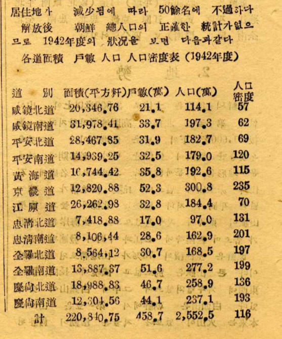
Note that the provinces are slightly different from the ones used on the map which are based on contemporary administrative borders. North Korea had only 8 provinces in 1950, the borders for the current 13 only being fixed in 1980. To get a more precise idea of where the main population centers were, this 1972 map from the CIA offers a more detailed picture of demographic density in the DPRK.
4. North Korean data collection during the Korean War
The US Air Force’s Thor Exeter Dataset was compiled by an active US military officer from records held at the U.S. National Archives with the stated goal of advancing strategic and academic research, while the original records he used were compiled by the US Air Force’s statistical services. But the US military was not the only one collecting data throughout the War. North Korean aviation units kept thorough records of the time flown on each of their aircrafts as well as of the kerosene used:
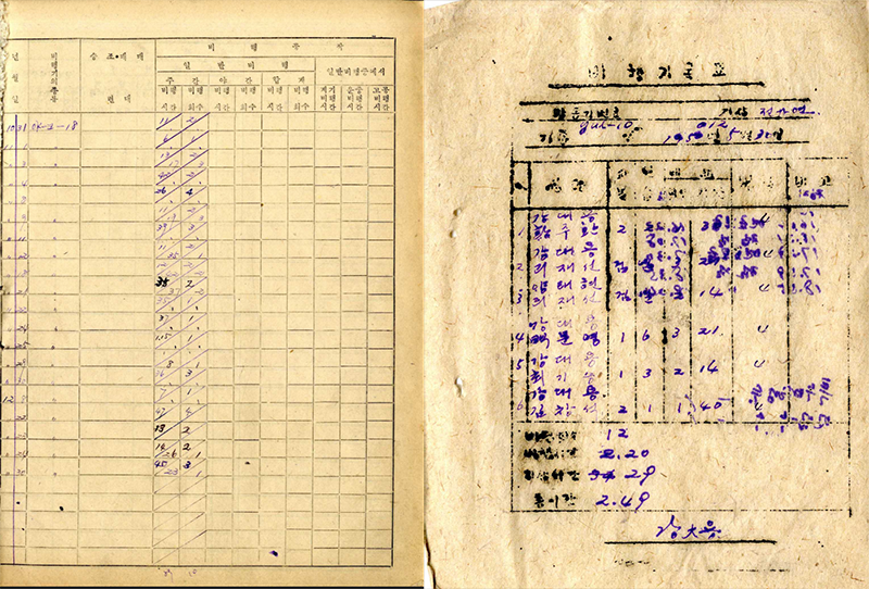
Unfortunately the pieces of data that are left are too scarce and too poorly contextualized to be compiled into a meaningful dataset. It is unclear whether these forms were ever meant to be used beyond the the necessities of each units’ administration and book keeping. There is, however, evidence of a large scale data collection project related to the war.
During the summer of 1950, shortly after the outbreak of the war, the North Korean state launched a national survey on the damages caused by the war to material possessions of the state and its citizens (전쟁으로 인한 국가와 인민들의 물질적 피해 조사). In each ri, the smallest territorial administrative unit, a survey committee comprising representatives of social organizations affiliated with the Workers’ Party, representatives elected to the local People’s Committee and state planning officials, was established to record the material damages inflicted by the war. For every destruction caused by the war, a report would have to be filled within two weeks and copies transmitted to higher levels of the administration within the next month.
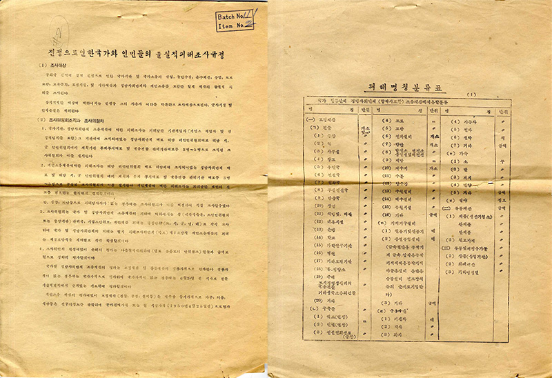
The instructions of the survey seems to have been followed quite seriously, as the RG-242 archives hold several reports following the format outlined in the above document. More often that not, the documents are not reports about damages caused by the war, but more precisely, damages caused by American airplanes : reports on damages cause by enemy planes’ aerial attacks (적기 공습 피해 관계), survey of damages caused by aerial attacks (공습피해조사), survey forms for the damage cause by American aircraft (미국 항공기에 의한 피해조사표)… While these surveys focus on material damages, some also mention the number of casualties (death statistics were however expressly stated to be outside the scope of the survey). A report filed on August 25th, 1950 in Ch’ongju, in present-day South Korea, thus reports, along with the destruction of 379 houses and 19 government building, 44 deaths and 33 wounded, all women:

All the remaining survey forms are from Summer or Fall 1950 and it is unclear whether the survey continued once the tide of war turned after the Inch’on landing. What is certain, however, is that the North Korean press did little to publicize the results of these surveys. That is certainly remarkable considering not only the intensity of the air raids, the number of casualties they caused, but also how they later became such a central point of the state’s anti-American rhetoric. A possible explanation is that the wartime propaganda heavily emphasized the Korean People’s Army’s prowess in the air and the ability of artillery gunners to take down American planes.
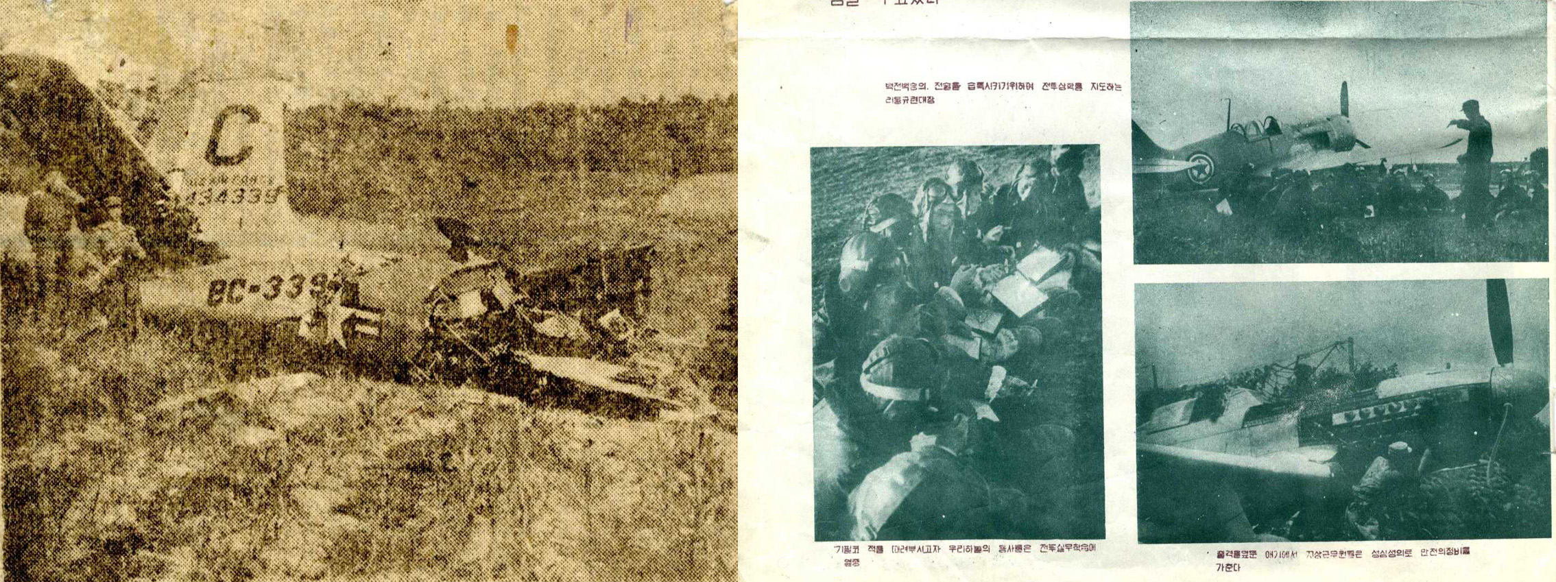
Much more than bombings, the death statistics publicized by the states were about “massacres” (학살) perpetrated by US soldiers, which allowed propagandists to tie the numbers within poignant narratives of enemy cruelty and inhumanity. An interesting example would be a pamphlet published by the Office of Cultural Training of the Korean People’s Army Propaganda Headquarters and entitled : The Hordes of American Robbers are Indiscriminately Slaughtering Korean People (미국강도 무리들은 조선인민을 무차별 학살하고있다). The pamphlet’s author first lists numbers about death and destruction in a small village near Ch’ongju before adding the narrative of a 9 year old girl tortured by the American enemy and tales of black soldiers (깜둥이) raping and plundering. In this perspective, the scale of destruction matters less than the inhumane way in which it was inflicted and stories of atrocities made for better propaganda than list of numbers.
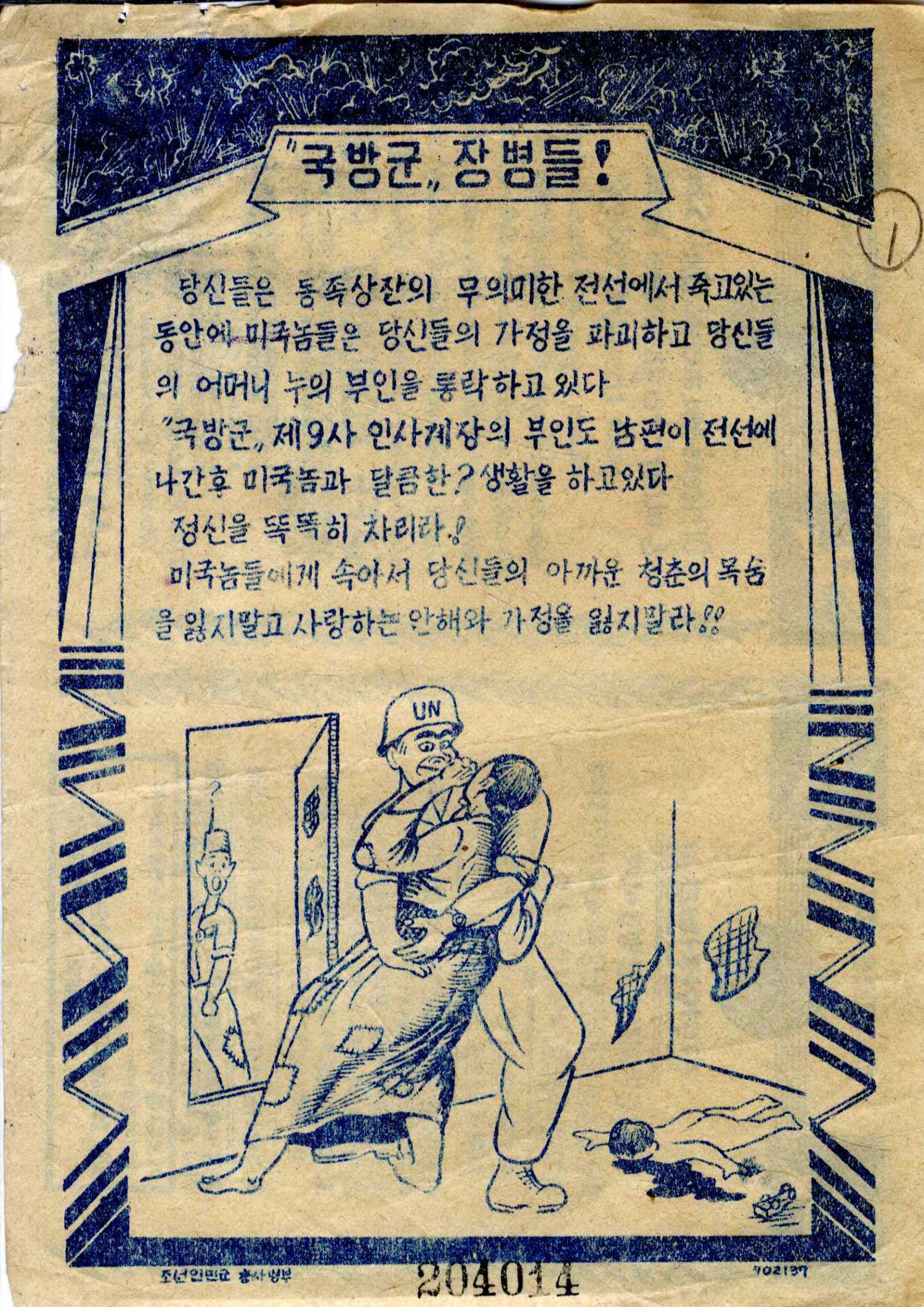
This does not however mean that North Korea entirely shunned quantitative data in its propaganda. Much to the contrary, a very common sight in the multiple leaflets and newspapers circulated by the Party’s Agit-Prop department were tables summing up the numbers of POW captured and enemy weapons seized by the KPA:
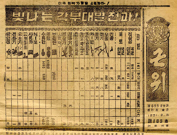
Contrary to the figures used when evoking massacres, the numbers are not part of a larger textual narrative, because they, in a way, tell their own story. The neat, geometric, score-board like presentation, the clear-cut taxonomy and divisions leaves no space for questions or doubts. The table belongs to the domain of rationality and objective quantification. The numbers tell not only the story of victory, but also the story of its undeniability. In this aspect, the data publicized by the KPA might not be so different from the one compiled and published by the US Air Force.
